Browse Plan Categories

Meet Upsie

Return navigate_next
How to Edit and Boost Fall Colors in Photography
August 20, 2021 *
Leaves are changing and fall colors are emerging across the country. We will soon find ourselves surrounded by yellows, oranges and reds, which is always stellar for photography! Whether you are hiking somewhere for amazing landscape views or capturing portraits with a great natural backdrop, I’ll help you bring out those beautiful fall colors in your photographs.
All of the tips on this blog post are for editing your photos using Lightroom. Other applications should have similar adjustment options.
Initial Adjustments
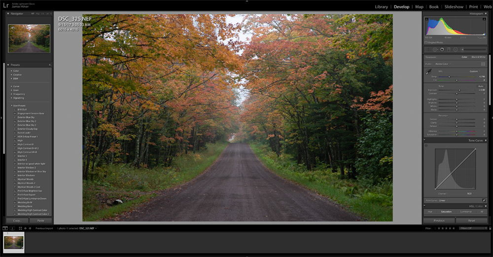
I took this shot near the North Shore of Lake Superior. I captured this shot in raw format and uploaded it into Lightroom. The reason that I decided to shoot in raw is because I can edit the file more than I could a jpg file in post-production. As you can see, the original photo file has a very flat profile with very little contrast. There is plenty of room to boost that contract in light and colors!

This photo shows my initial adjustments. I made some tone adjustments, added a small “s curve” in the curves, and boosted the vibrance/saturation a touch. Here you can make your adjustments that feel good to you.
Hue Adjustments

Next is the adjustments that will help put a little more focus on those fall colors! Scroll down in your adjustments panel to HSL/Color. You have a lot more control over the colors of your image in this section. We will start out with the hue section. The main colors that you will want to adjust for your fall colors are the red, orange, yellow and green. Feel free to get as creative as you want, but adjust these parameters in moderation. It is always good to keep your image representing what it was like as you experienced it, but in the end, it is YOUR art. Feel free to experiment and have fun manipulating all of the colors!
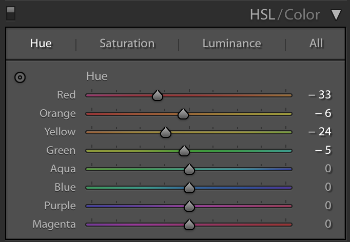
Here, I manipulated the reds a little more toward the magentas to separate them from all of the oranges in the leaves. I then brought the oranges very slightly toward the reds without changing the oranges too much. Next, I brought the yellows toward the oranges to take out a little bit of the greens. There is plenty of green in this image, so I want to slide those slightly toward the yellows for more of a fall feel. I found these adjustments blended well together while representing the colors I saw in person more accurately.
Saturation Adjustments

Now move to the saturation tab within the HSL/Color section. Here you control how much saturation is in each color of your image. Again, be careful how far you go with these adjustments. Over-saturating your images can quickly make them look fake.

Here, I bumped up the reds and oranges. Those were the two main fall colors I wanted the focus to be on, and I actually decreased the saturation of the yellows and greens. I thought the greens were a bit distracting, so I wanted to mellow those down to keep an overall softer feel without the entire image feeling oversaturated. It was a cloudy day, so there was not much blue in the image, but I decreased the saturation of the blues and purples to eliminate any chromatic aberration that may be around the contrasted edges.
Luminance Adjustments

Now move over to the luminance tab of the HSL/Color section. Luminance is the adjustment of the brightness of each color. Depending on the exposure of your image, there may be some colors you want to make darker or brighter to bring them out more.

I shot this on a cloudy day, so the exposure was pretty even throughout. There are no harsh highlights or dark shadows. After my initial tone adjustments, I felt I needed to brighten up the reds, oranges, and yellows. To take more of the focus away from the greens, I brought the greens down, which darkens them slightly. I also adjusted the blues/purples to, again, combat any chromatic aberration issues.
Split-Toning Adjustments

If you scroll down further, you’ll find the split-toning tab. Here you’ll have a little more control over the overall colors of your image. With split-toning, you can add the colors of your choice to the highlights and shadows, which can create better contrast in the colors throughout your image.

Here, I slid the hue slider of the highlights to the orange range. This adds a little bit of orange saturation in the highlights. Then I slid the shadows to the teal/blue range and saturated that about half as much as I saturated the highlights with the oranges. These colors complement each other well, which maintains balance in the image while boosting the fall colors a bit!
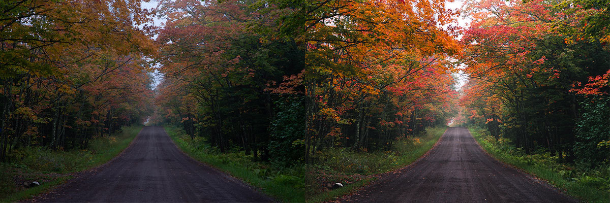
Note the changes in the before and after photos. The initial photo was underexposed, so I brightened it up. I added contrast in the light and color of the image from the initial flatness of the profile. From there, the HSL/Color adjustments really helped bring the fall colors come to life! Again, use these adjustments in moderation as over-doing it can make your image look fake or “over-processed” instead. Play around with these parameters and find out what works best with your editing style!
If you have any new cameras or lenses, purchased within the last 60 days, take the extra step and protect them with Upsie. Purchasing a warranty now is a small price to pay for having peace of mind that your gear is protected from drops, liquid damage and other accidents. Check out their camera warranty plans today.
About the author: Jamie Hiner is a professional photographer and videographer from Minneapolis, Minnesota. He specializes wedding, real-estate, commercial and wildlife. Check out his website, Instagram and Facebook.
Learn About Camera Warranties:


* This article is over 6 months old and may or may not be updated.